I’ve been on a medication for Bi-Polar disorder for a month. It was one of several I’ve tried over the past few months, but this one seems to be keeping me steady, has few side effects, and gotten me to feel like myself again. It’s a quite wonderful feeling.
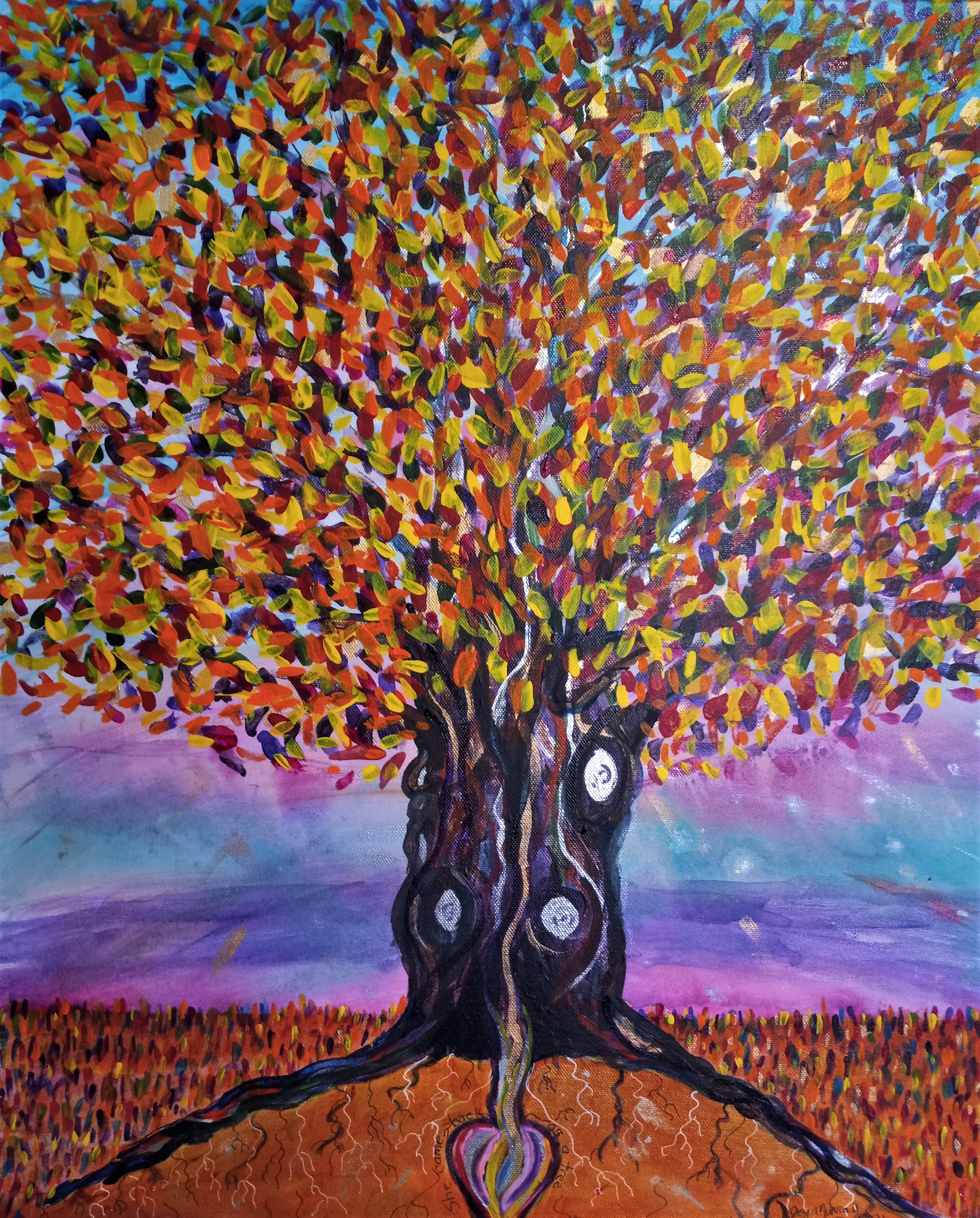
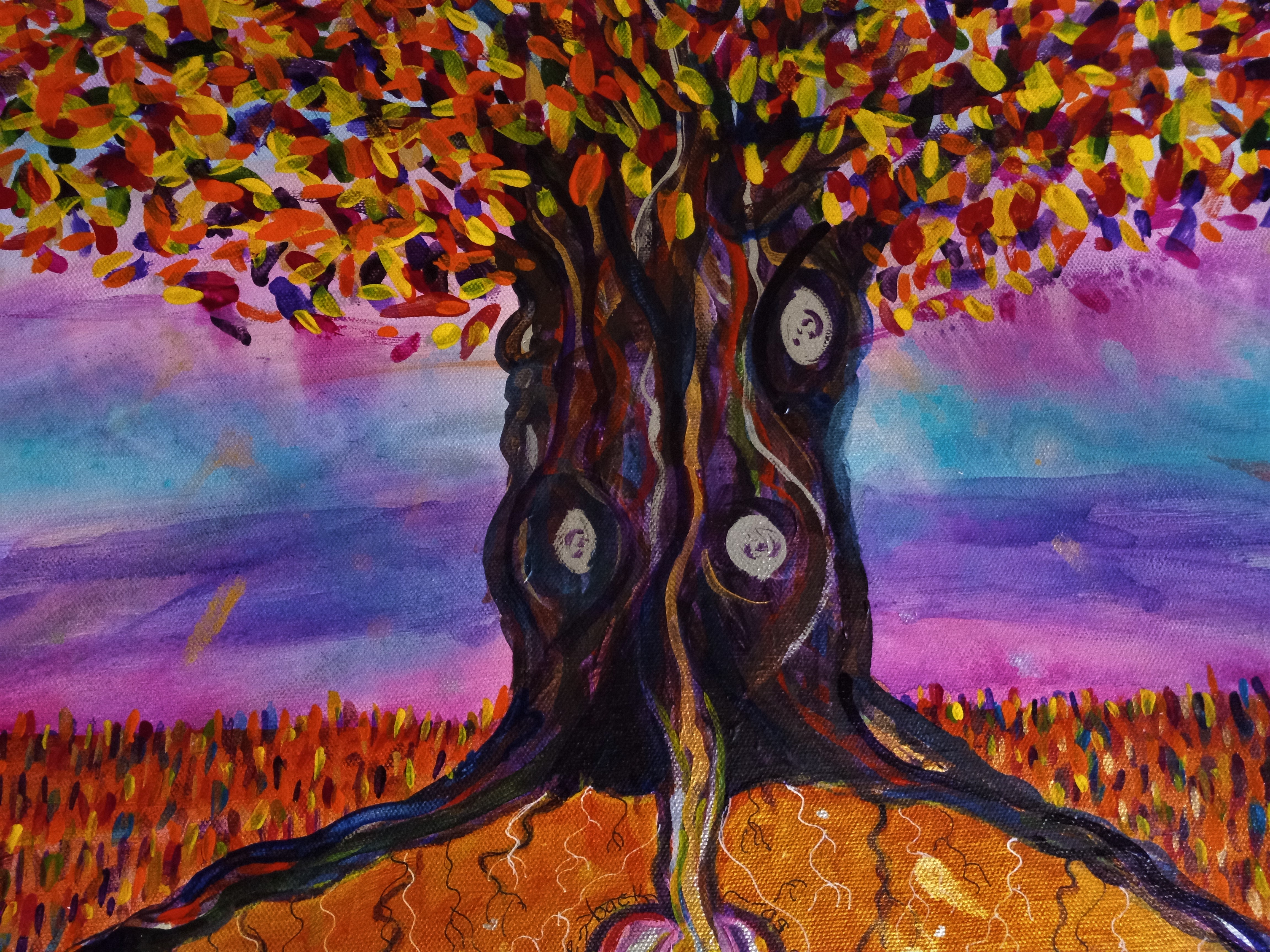
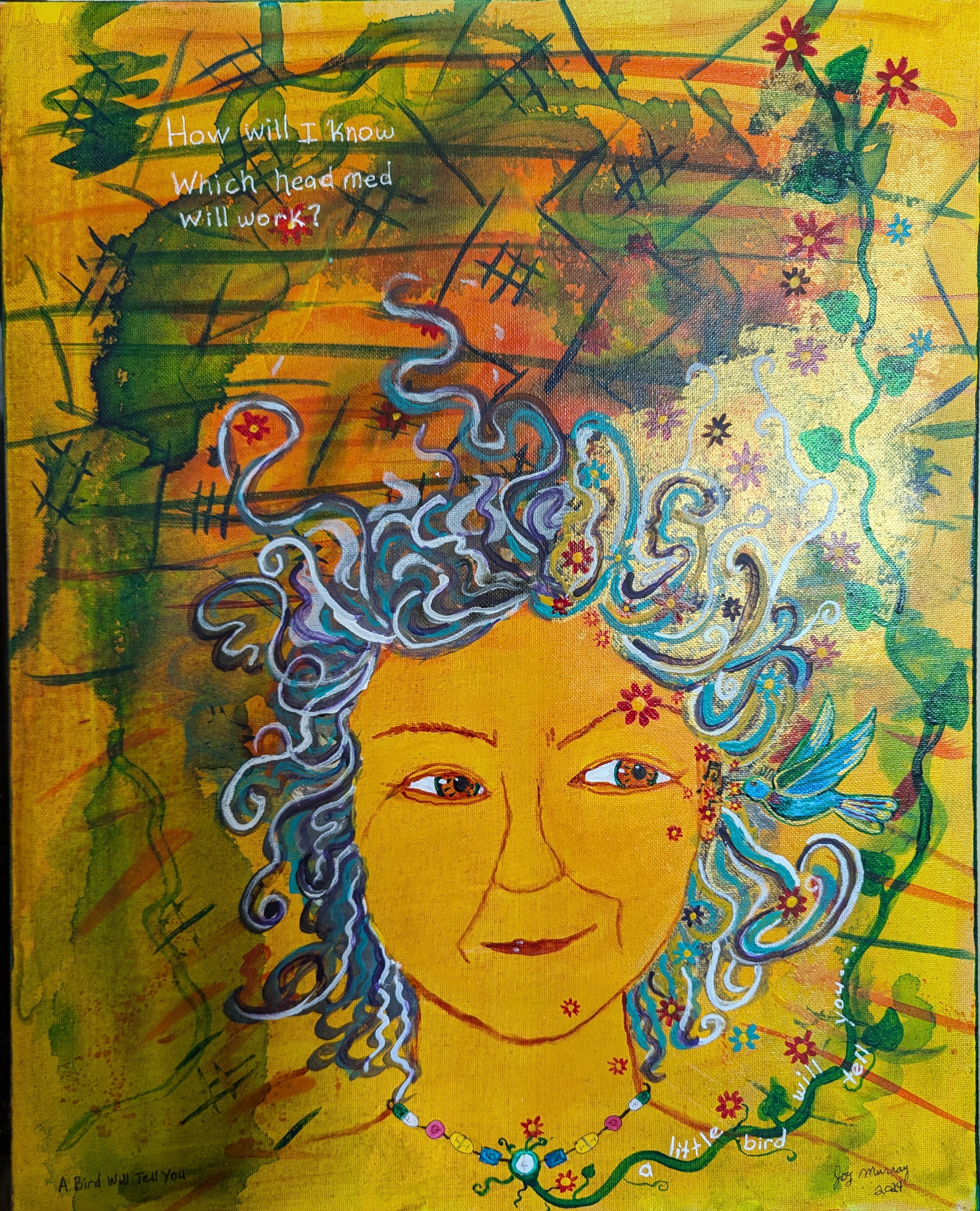
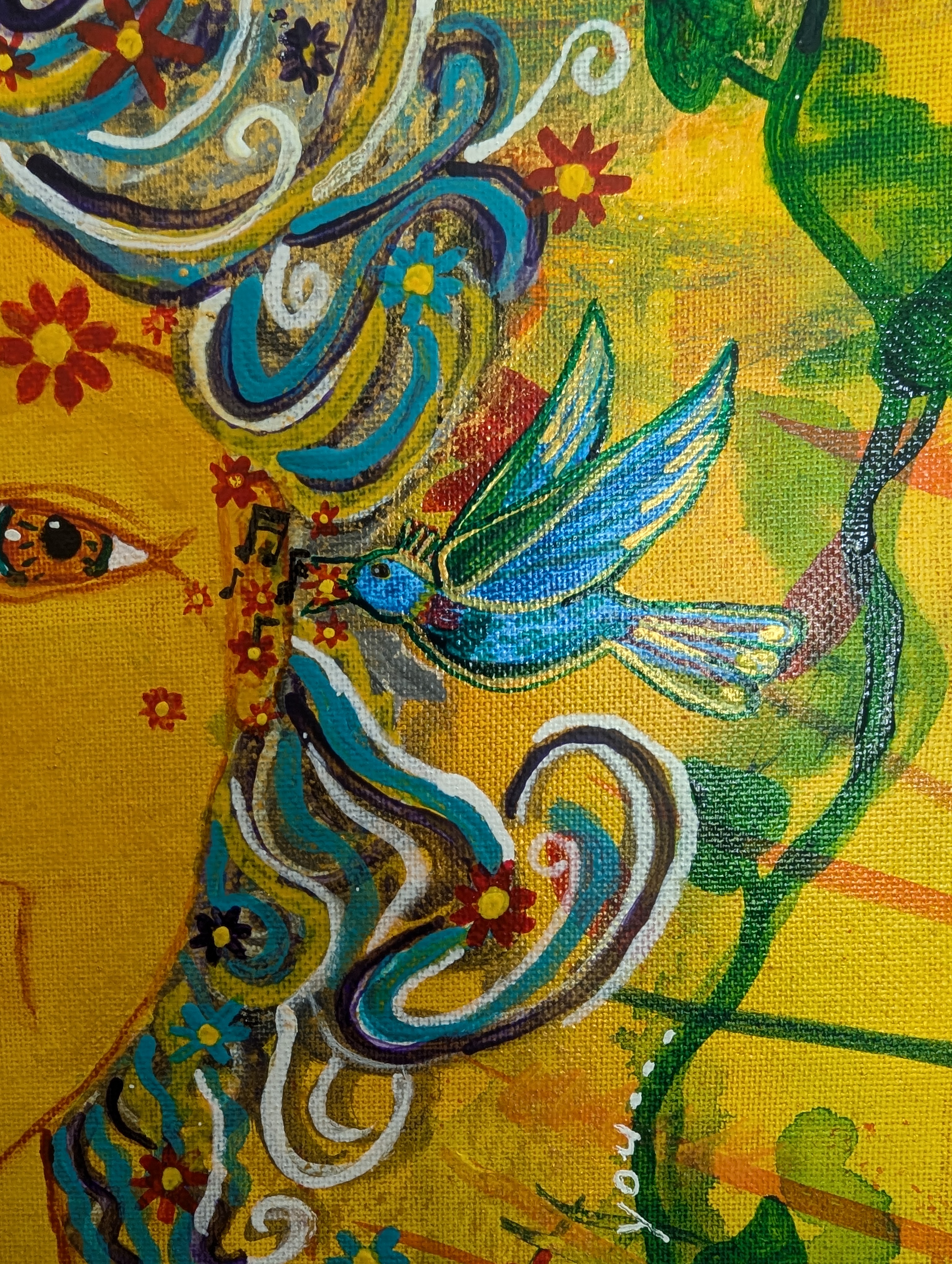
I started this journey years ago, really, but this most recent bout of depression started in October. Then it was hard to be creative or to see any point to painting, writing or anything. I’ve done some work, but getting into a routine, finishing things – it’s been next to impossible. For this painting, I just started splashing paint on a canvas, cleaning brushes by smearing leftover paint on it, and letting it collect color.
But since I started this medication, I found some direction and a composition emerged. It became a sort of journal of my recovery. And then, one day, it was a finished painting. I hope it captures the way the treatment of a mental disorder, and the journey to brain health, is a process.
What do you think?


I hope to continue to be inspired to paint. I have already come up with ideas for two more. Getting back to a creative state of mind is a pure delight. I really appreciate my doctors and therapists who have helped me during this bout of dysfunction, who helped guide me back to good brain health. I also did a lot of reading on mindfulness and ways of maintaining brain health in a world that seems fragmented and in a constant state of mania.
If you’re having struggles yourself, I hope you find the kind of help you need. And remember it’s a journey. Just because one treatment doesn’t work for you, don’t give up. There are lots of options for our complicated brains. Keep searching for a doctor you trust, keep trying different treatments, until you find your way back to yourself.
~~~
Thanks for reading my blog. Feel free to share it, if you’d like.
This blog is brought to you by the generosity of people who support me on Patreon , buy my art, and who support me in so many different ways.
If you’d like to make a one time donation, you can do so at paypal
Cards and prints of some of my art is available on Redbubble. Also T-shirts and stickers and other odds and ends. When you click an image, in the lower right hand corner you’ll find a link to all the various products that these are printed on. If you have any trouble finding what you’re looking for, let me know. joyzmailbox@gmail.com
You can subscribe to this blog by email in the link below this post.
If you find a typo, let me know, and I’ll send you a postcard.