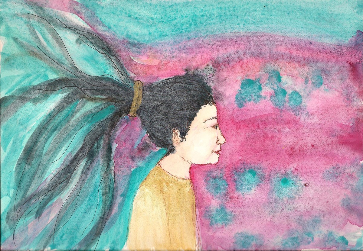
I did some test paintings on Arches paper, trying to decide if I like cold or hot press more. The first one is on hot press paper. I used ink for the drawing and granulating pigments for background and hair.
The next was on cold press paper using the same pigments, and others, and I did the outlines in pencil:
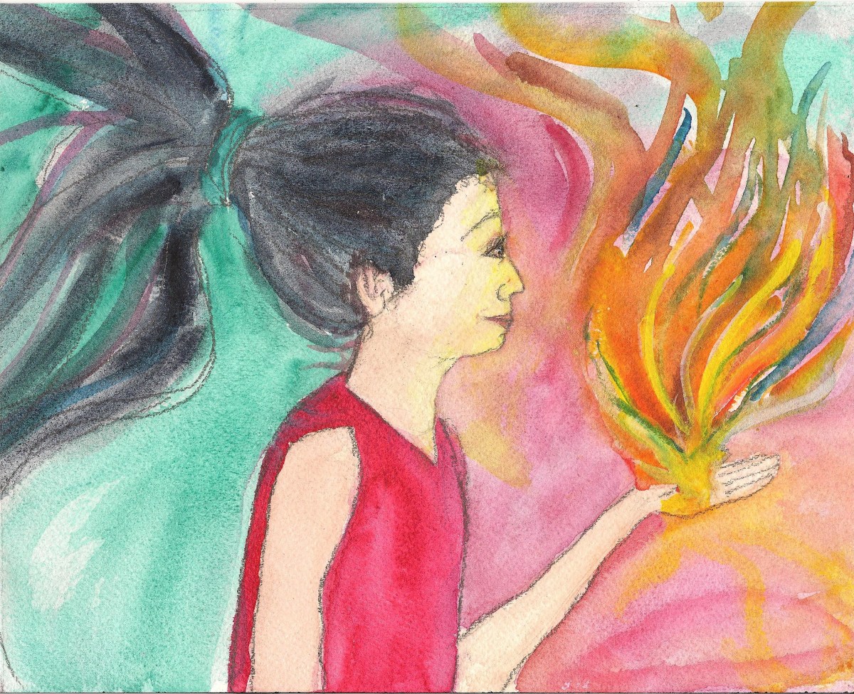
I wanted particularly to see the difference it made in creating smooth skin tones and background washes.
I like the way the background colors settled more in the cold press paper but I liked the way the ink flowed smoothly on the hot press. The skin tones seemed to settle smoothly enough of on both.
I realize these are different paintings, but do you have any opinions or preferences? Does one seem to have richer colors than the other?
Thanks in advance for your comments.
I’m drawing daily to help manage depression, long-term disability, and life in general. If you’d like to see the beginning of this project, you can see it here. You can also follow me through WordPress or on Facebook.
Your thoughts and shares are appreciated

Hi Joy. The cold press colors are much richer and vibrant. That’s my 2 cents worth.
I thought so too. Thanks.
I prefer the cold press background too – the hot press is too grainy. But both lovely paintings. 🙂
I think the same. If I use paint that’s non-granular then it might work better. But for now I’ll stick to cold press. Thanks for the feedback.