Nothing Much

I started this sketch to see if I could capture an older face.  I sketched in pencil, then ink, then used acrylic paint.  I’m beginning to really appreciate the flexibility and quick drying time of acrylics — I tend to want to paint quickly, chase after a bright idea and see where it leads.  I was pleased with the result of this.nothing much

The title came to me as I was finishing it up.  I love it when that happens.  I thought this piece would be about the frailty of the aging body, but instead it became about something more like strength.  It comes in many shapes, doesn’t it?


She Thought Differently

I went to the Open Crit at Crosstown last Tuesday.  It was an impressive meeting and I enjoyed seeing the artists in a personal venue.  I can’t just sit still, though, so I started to doodle.  One of the things I’ve enjoyed about being back in Memphis is seeing all the elaborate and beautiful hair styles that Memphians create.  As I was doodling hair and plants, one of the artists talked about his head injury.  He didn’t say that they caused any problems with his brain, but I know several people who have had head injuries with resulting brain damage.  These thoughts combined in this doodle:

different sketch

The idea stuck with me afterwards.  I’ve been playing around with acrylic paint on paper and I did several variations of the doodle, and finally made one I’m happy with.

different
She Thought Differently, acrylic and ink on paper, 8.5×11″

Injuries are a challenge, no matter their source or their resulting limitations.  And yet, we find a way to cope, to sublimate, to bloom in unexpected ways.

What do you think?


Unique village, Charming Book

village-is-a-busy-place-200x200

I’m always impressed with the innovative and colorful books Tara Books publish.  One of their latest, A Village Is a Busy Place! by Rohima Chitrakar and V. Geetha, is an activity book with a structure I’ve never seen before.  It’s illustrated in the Bengal Patua style of scroll painting.  It unfolds and the picture gets bigger and bigger, each illustration blending into the next, until it’s about 4 feet long.


It opens with plans for a wedding, shows what a  normal day is like in the village, and how everyone works with each other to meet the village needs.

village-spread-3-200x200

The text is on plain white paper, bordered in yellow.  Children can look for the wedding chair, the cat, the cooks, the fishermen and other things described in the text.  Because the illustrations are done in folk art style, the search will help develop visual literacy skills, as well as introduce the culture of the Santhal people, who are among India’s largest indigenous communities.

village-spread-2-200x200

The book has a grommet in the top so it can be hung as a colorful work of art in a classroom, or in my case, my art studio.  Here’a video by Indian Mom’s Connect that shows how the book unfolds:

It’s charming and wonderful to read to children,.  They love to see new styles of books, books that surprise and delight.

You can find a copy of the book through Tara Books or Amazon.com.  I urge you to look at Tara Books website.  It shows the fascinating process of how their books are made as well as information on their many publications.

You can also see other books I’ve reviewed from Tara books here:

Slender Art Galleries

Carnival Book

Don’t let  your age keep you from reading picture books.  Delight has no age limits.


Back to the Drawing Board

I’ve finally gotten my drawing space somewhat in order after moving from Portland, Oregon, to Memphis, Tennessee, in May.  I have wonderful southwestern light and lots of space.

20170612_160816

I’ve missed doing my daily drawing practice.  I’d hoped to keep an excellent travel journal, but it turns out, I wasn’t that good at it.  I get car sick if I try to draw while I’m in a moving vehicle, and when we stopped, I was too tired to do much.

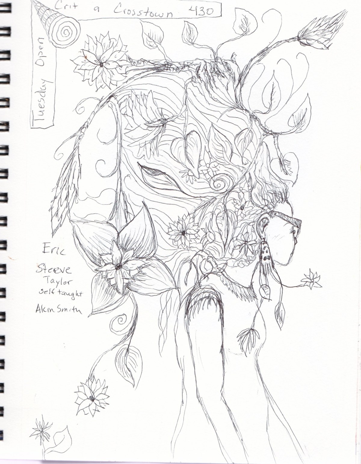
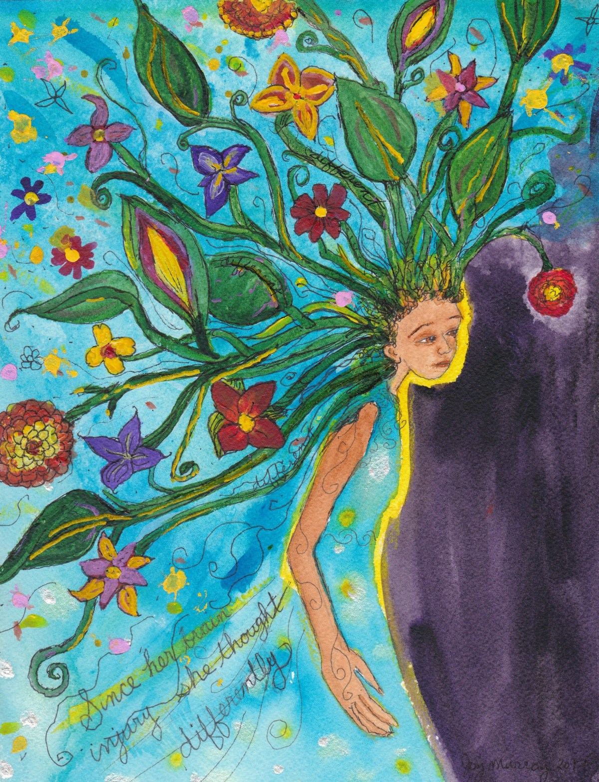
Moving always unsettles the best laid habits, but I’m slowly getting back into both writing and drawing daily.  I confess I started drawing and painting earlier in the month and was appalled at what I produced.  I’m trying new techniques and experimenting with acrylics and ink.

I’ve also been reading a lot.  My dear friend reminded me of the novella The Lover by Marguerite Duras.  A beautifully written work with the immediacy of poetry, I was glad to re-read it and hold it in my heart again.

Marguerite cover

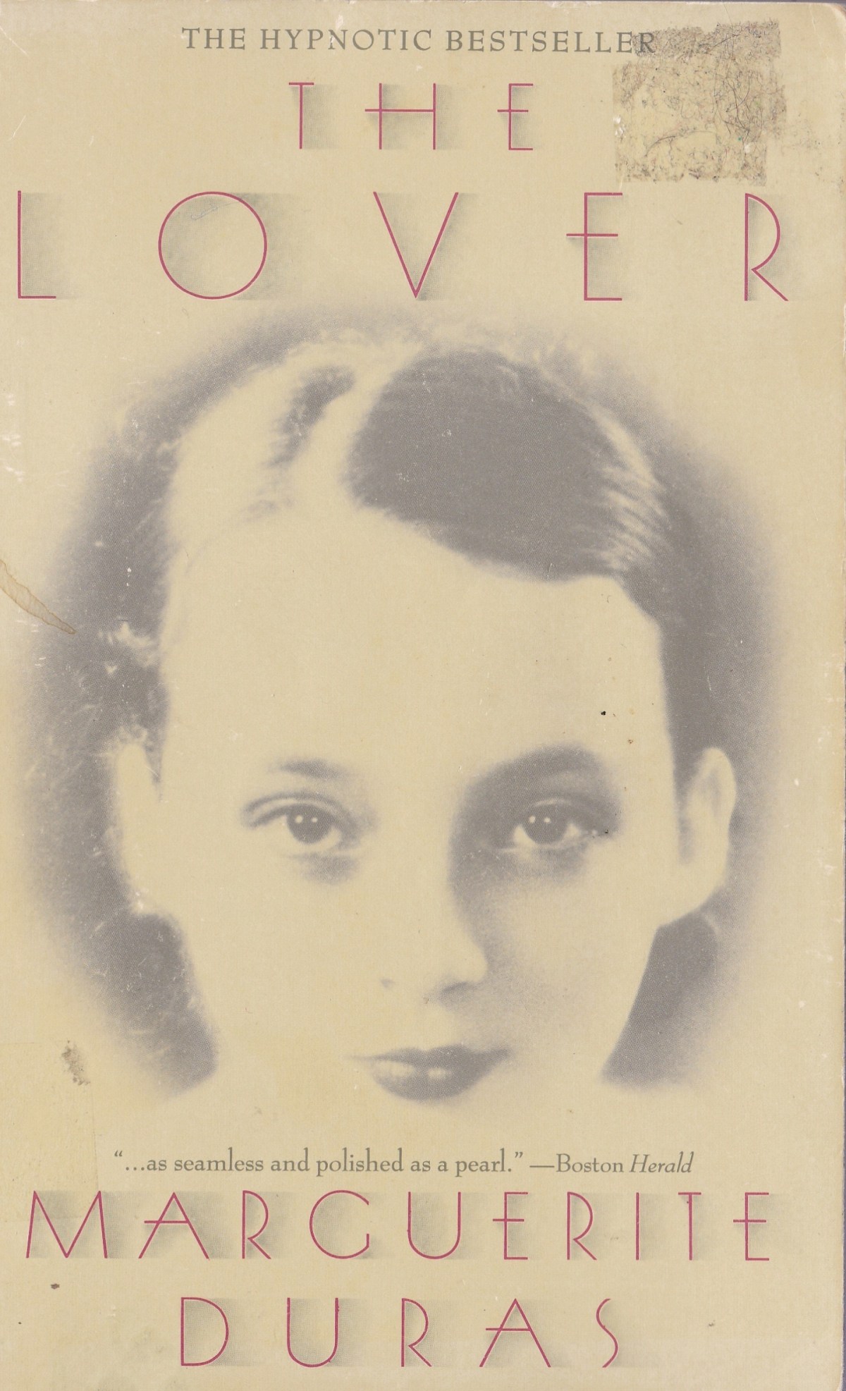
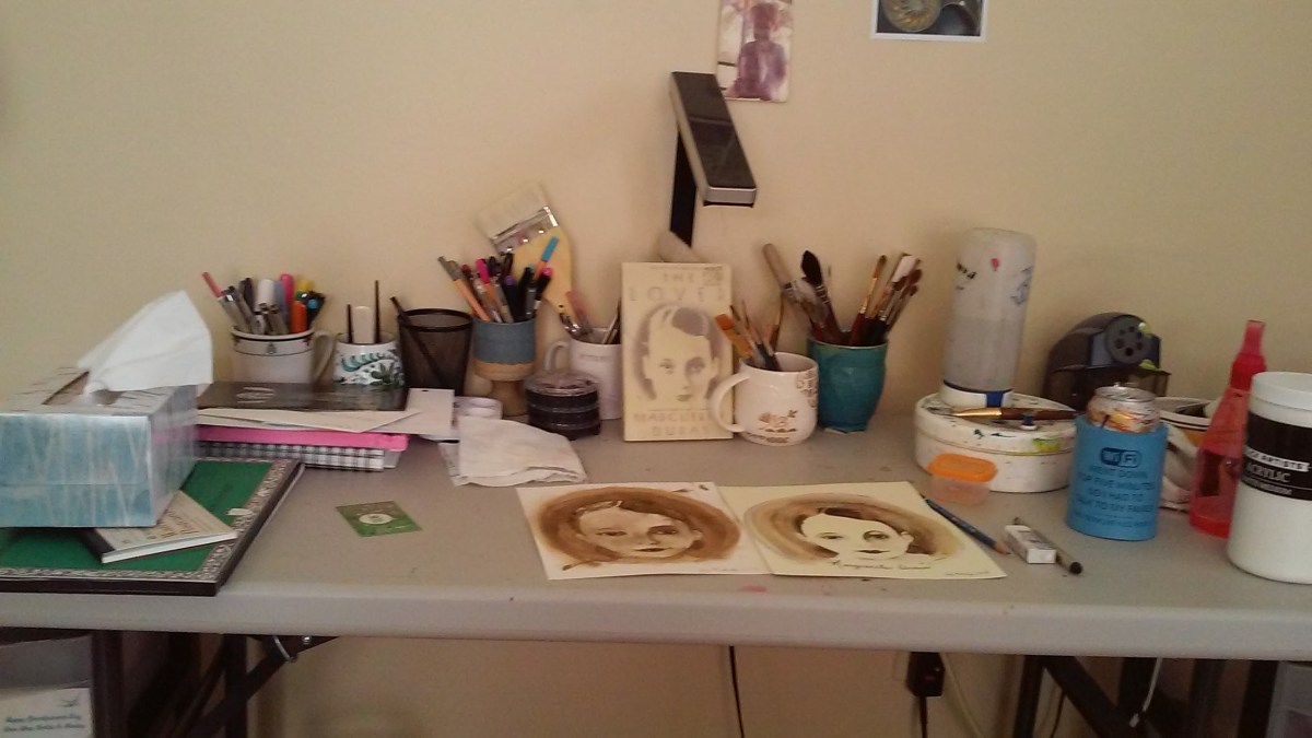
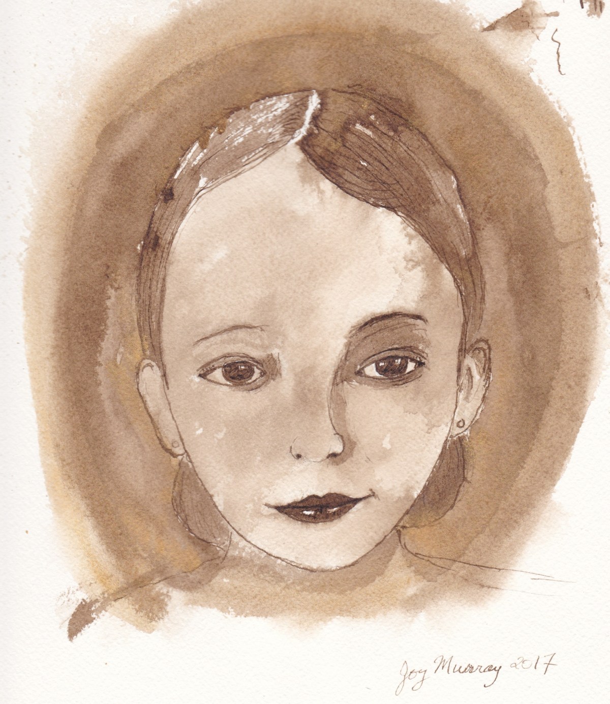
I was intrigued by the cover photo of Marguerite, which was taken when she was fifteen, I think.  I decided to try to paint her.  The first one, I drew in walnut ink, then used the ink for washes.  I wanted to the capture the sepia tones of the photo.

marguerite

I decided to try another in watercolor.  I washed the paper with a very light sienna.  After it dried I used Daniel Smith sepia watercolor and gold gouache to try to capture her intriguing expression.marguerite 3


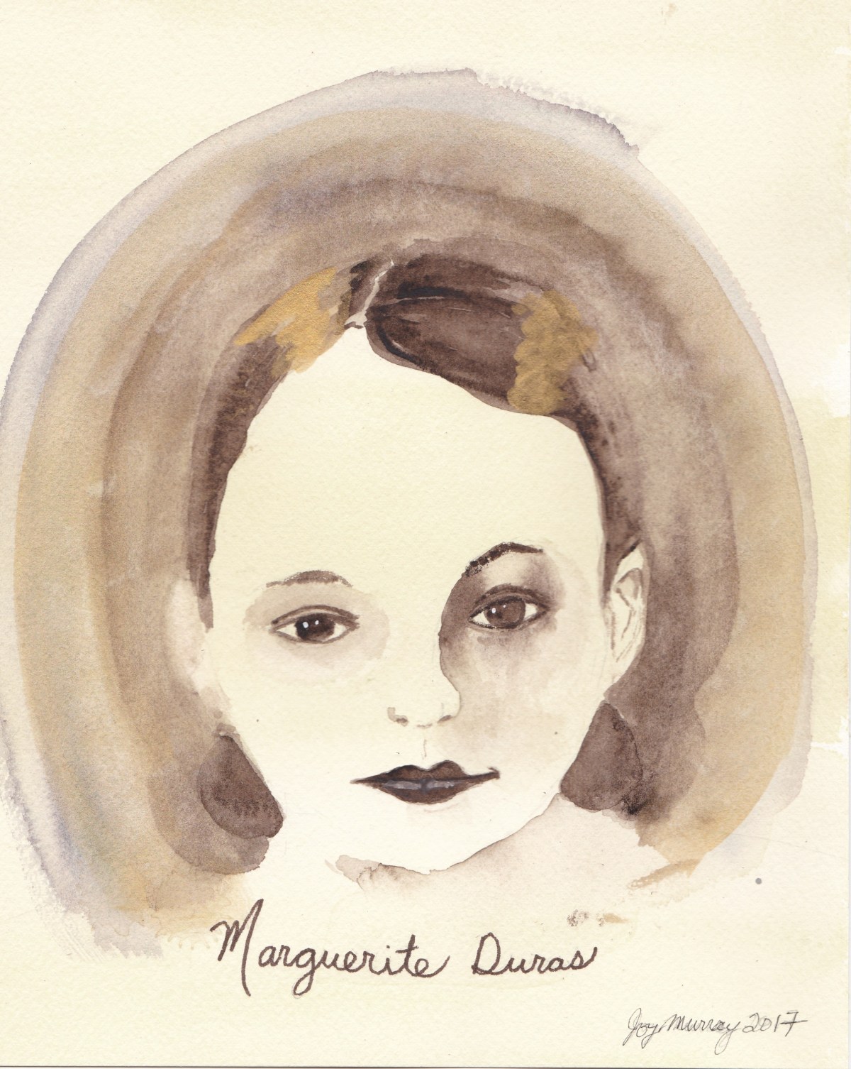
In the book, Duras writes,

“Between eighteen and twenty-five my face took off in a new direction.  I grew old at eighteen.  I don’t know if it’s the same for everyone, I’ve never asked.  But I believe I’ve heard of the way time can suddenly accelerate on people when they’re going through even the most youthful and highly esteemed stages of life.  My ageing was very sudden. I saw it spread over my features one by one, changing the relationship between them, making the eyes larger, the expression sadder, the mouth more final, leaving great creases in the forehead.  But instead of being dismayed I watched this process with the same sort of interest I might have taken in the reading of a book.”

A face is so much like the reading of a book.  I can only capture fragments from them, but I do so like reading the faces around me.   The curve of a line, the depth of a shadow can completely alter an expression or an identity.   I see so much clearer when I take the time to draw.